Theme Management
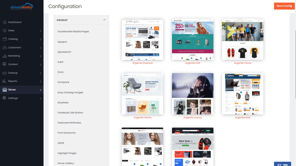
Theme editor is located at Admin > Stores > Configuration > Swissup > Themes Editor.
|
Here we using as an example the Argento Home theme. According to this example, we will guide you on how easy themes are set with the help of Theme Editor. |
Theme Design
Select theme from the list of available themes there. More detailed information on how a particular theme can be set can be found here: https://docs.swissuplabs.com/m2/argento/
Layout
The layout section allows you to apply boxed, full-width, or standard page layouts from backend settings. In the Body background, you can specify the body background for the page. The body’s background is covered by a page wrapper and it’s not visible. You need to limit max-width for the Page wrapper to be able to see body background. With the Content wrapper subsection, you can limit the width of page content.
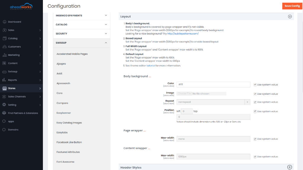
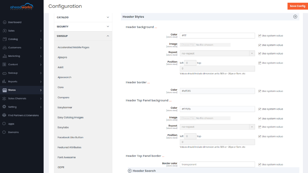
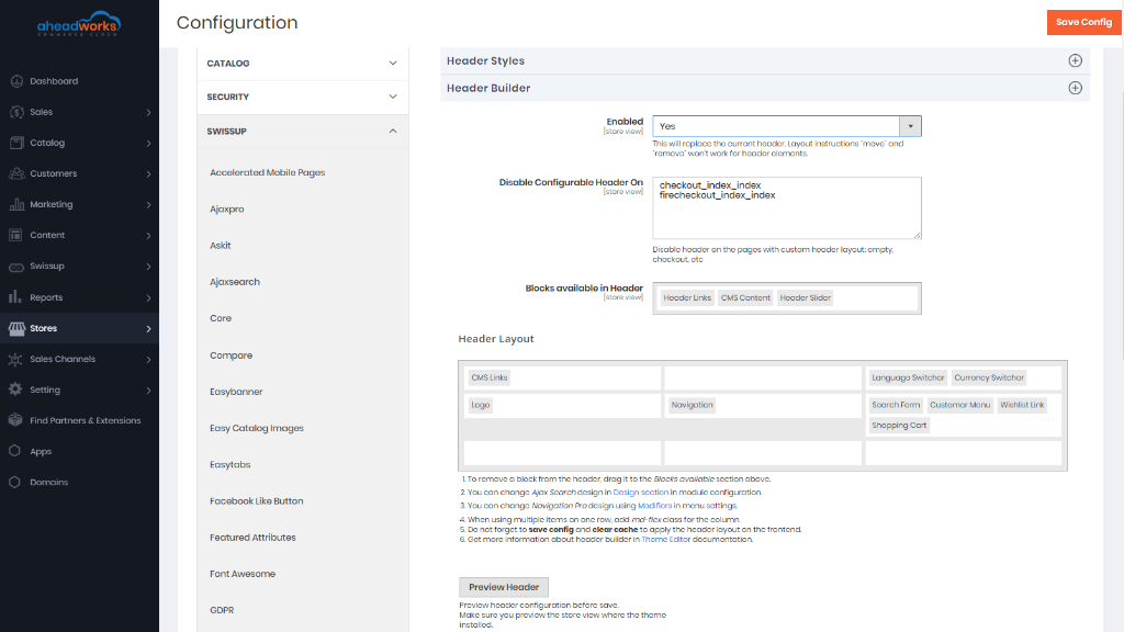
Header Styles
This section allows you to customize the slider on top of the page. Find a color palette that suits best for your business and customize your store page header.
Header Builder
With an enabled Header Builder, you can replace a static header with a fully customizable one.
Features:
- move header blocks between three rows and nine columns with an easy-to-use drag-and-drop interface;
- remove blocks from the header;
- set column settings and assign CSS classes for it;
- preview header layout before applying it on the frontend.
After you moved blocks or changed columns settings in layout, press the Preview Header button to see how your changes will look on the frontend.
You can resize the preview dragging its corner to test the layout on different window sizes.
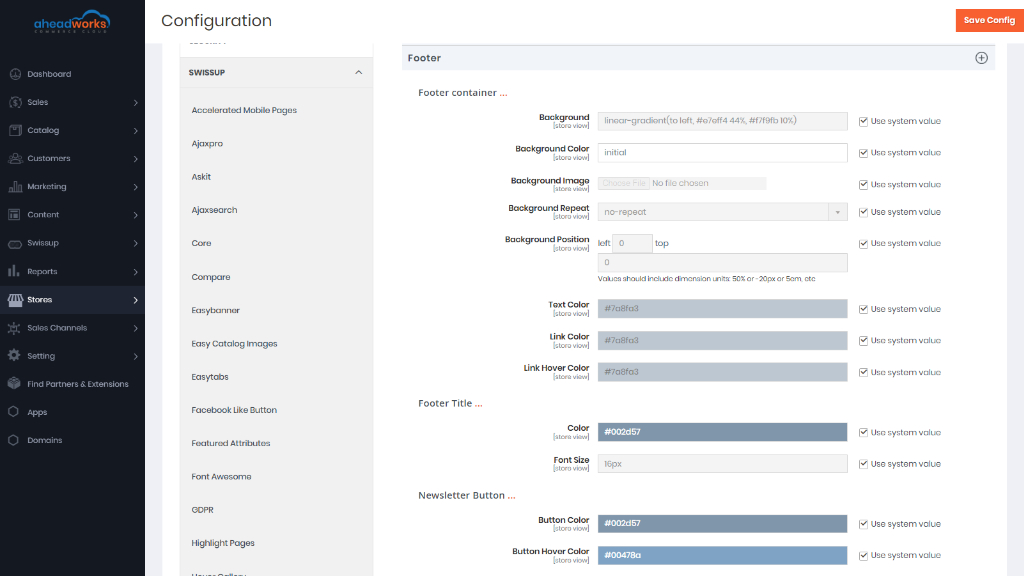
Footer
You can see options of footer section config in the slider on top of the page. This section allows you to change background, colors, and newsletter subscription form.
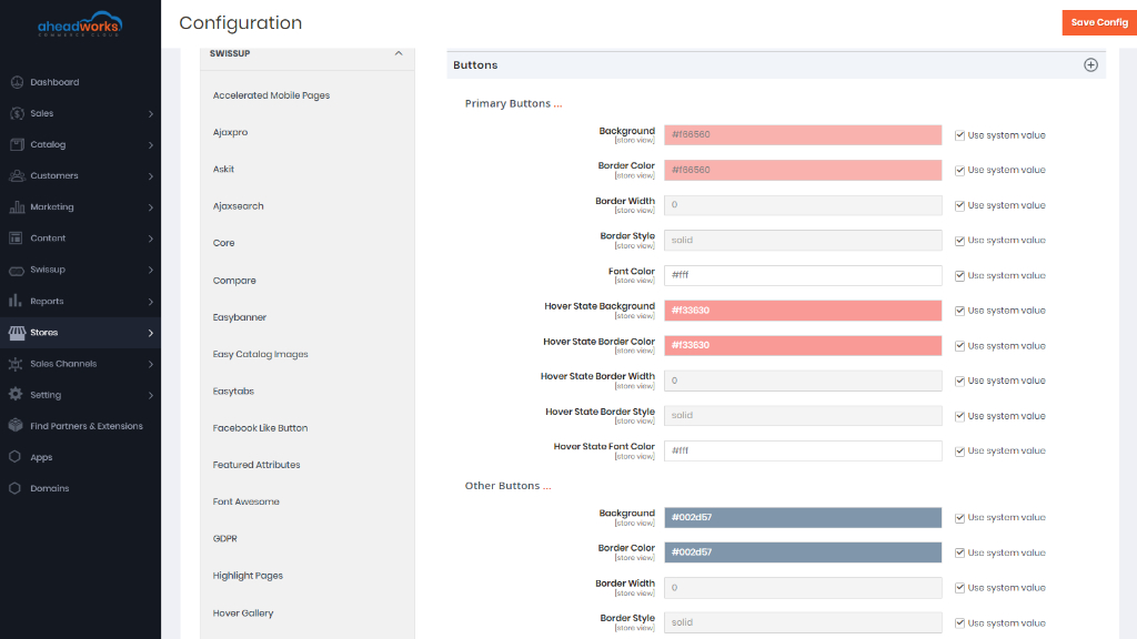
Buttons
You can customize primary and secondary buttons' colors in this section. Theme editor has a dedicated subsection to customize 'Add to Cart' buttons.
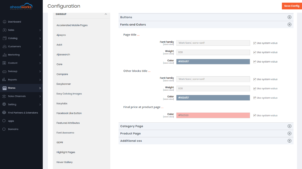
Fonts and Colors
Here you can change font and color for page titles and block titles. As well as the color of the final price on the product page.
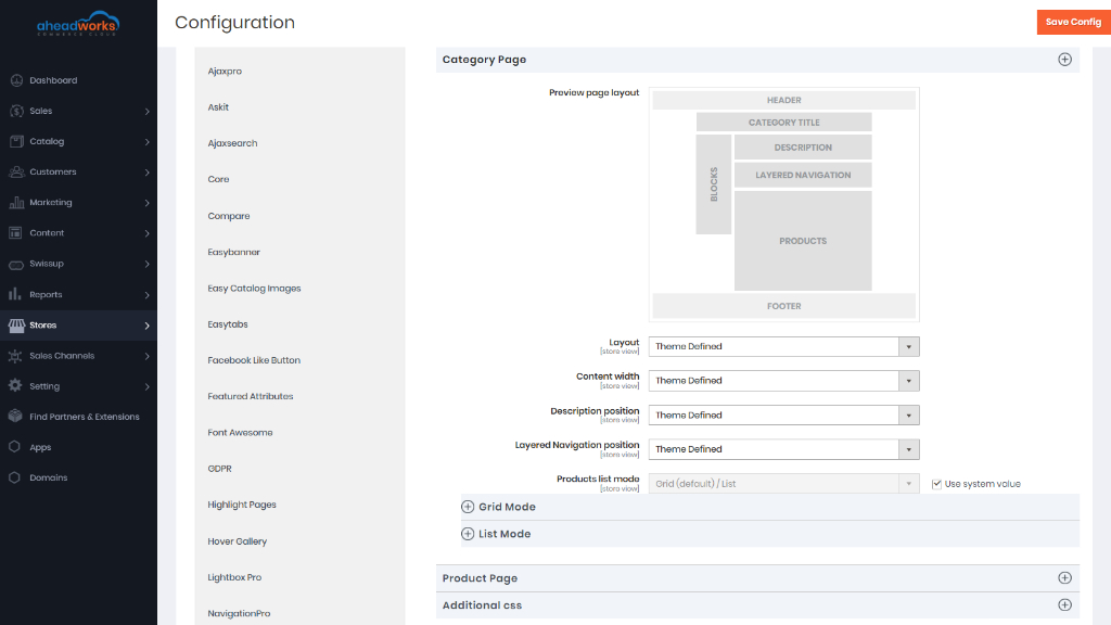
Category Page
The Category Page builder is a set of options with a preview feature to modify the look of the category page.
The general layout of the category page is two columns with a left sidebar. The left sidebar contains category filters and some other blocks (e.g. wishlist). With this instrument you can change page layout, the width of main content, category description position, layered navigation position, set the look of the product list.
In the subsection Grid Mode, you can determine the number of products displayed in grid view and set columns number for the grid. List mode for category page is not very common, but still, it can give your store a fresh look when it is configured properly.
More information on Category Page Builder can be found here.
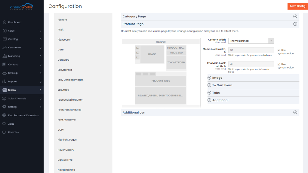
Product Page
The Product Page builder is a set of options with a preview feature to modify the look of the product page.
Pure2 and Flat Argento themes have a product page with two columns and a right sidebar layout. You can change it here. Other valuable options are content width, the width of the image block, and block with main product info. You can get a pretty fresh look at the product page when you set the image and main product info width to 100%.
This subsection allows changing the position of image thumbnails.
Here you can change the 'Add to cart form' position on the product page. You can move from under product image similar to Argento Stripes design. Or move it back to its normal position.
This subsection is powered by the Swissup Easytabs module. You can change the tabs layout and tabs position.
More information on Product Page Builder can be found here.
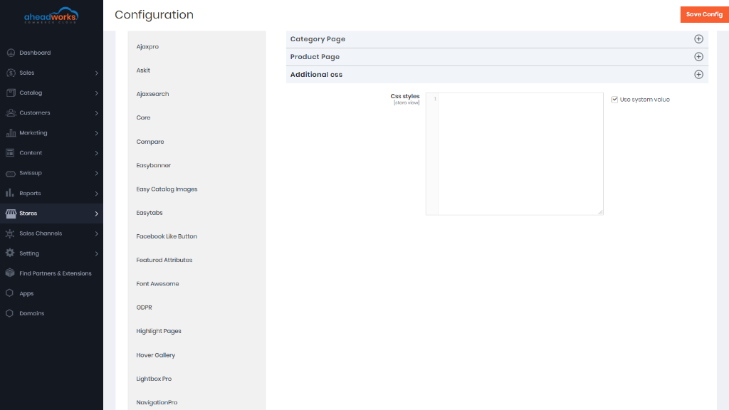
Slide Additional CSS styles
Use this section to apply some advanced styling.
Design Configuration
Find the store view that you want to configure and click on the Edit button in the Action column.
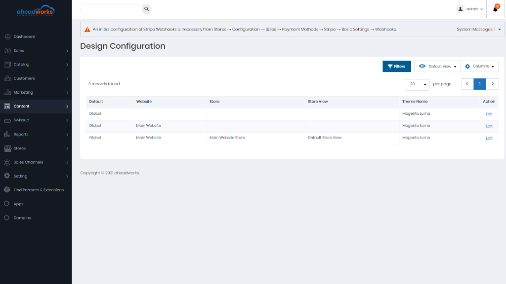
The page displays the current design settings for the store view. To change the default theme, set Applied Theme to the theme that you want to apply to the view. If no theme is specified, the system default theme is used, if the theme is to be used for only a specific device, set the User Agent Rules.
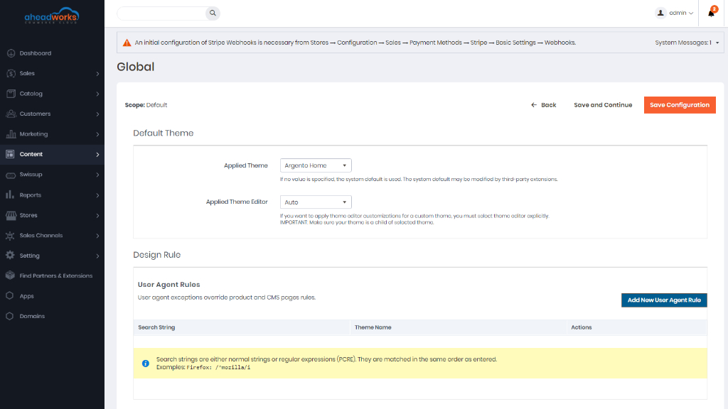
For each device type where you want to specify a theme click on Add New User Agent Rule button. For Search String, enter the browser ID for the specific device. A search string can be either a normal expression or Perl Compatible Regular Expression (PCRE). For Theme Name, choose the theme to be used for the specified device. You can add as many rules for the devices you want to designate. The search strings are matched in the order they are entered.
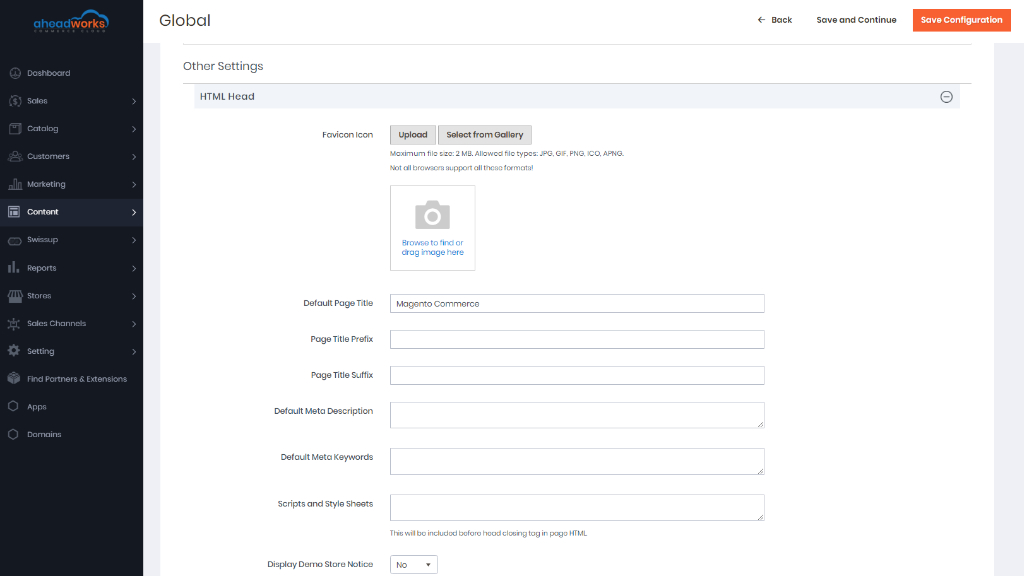
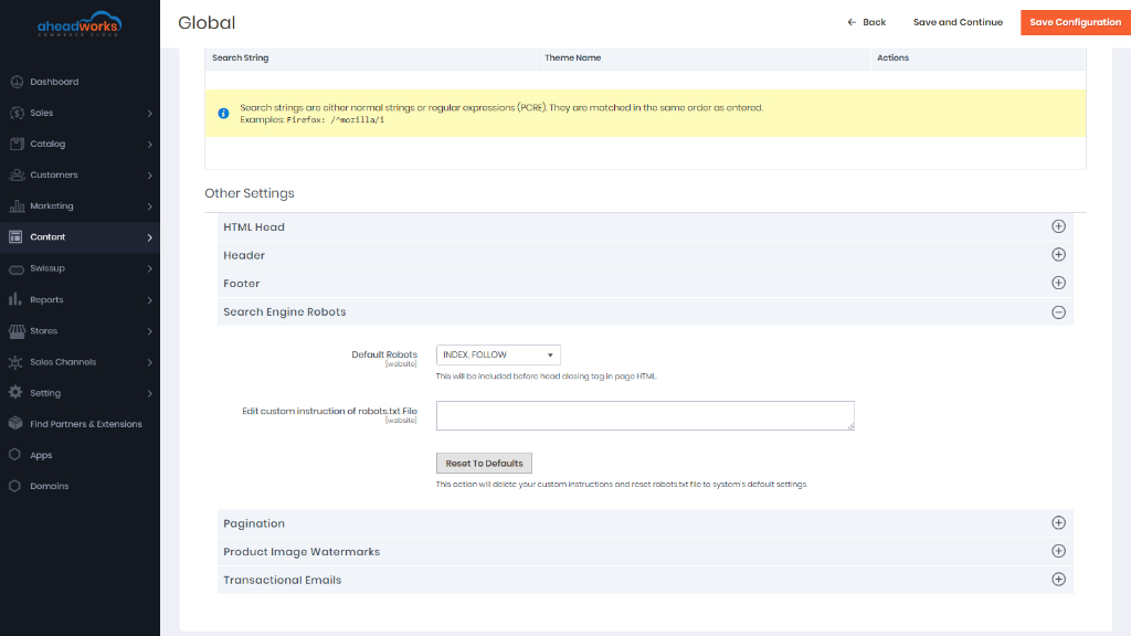
HTML Head
The settings in the HTML Head section correspond to the <head> tag of an HTML page and can be configured for each store view. In addition to metadata for the page title, description, and keywords, the section includes a link to the favicon and miscellaneous scripts. Instructions for search engine robots and the display of the store demo notice are also configured in this section.
must be more products in the list than are allowed per page in the product list configuration.
Find more information here.
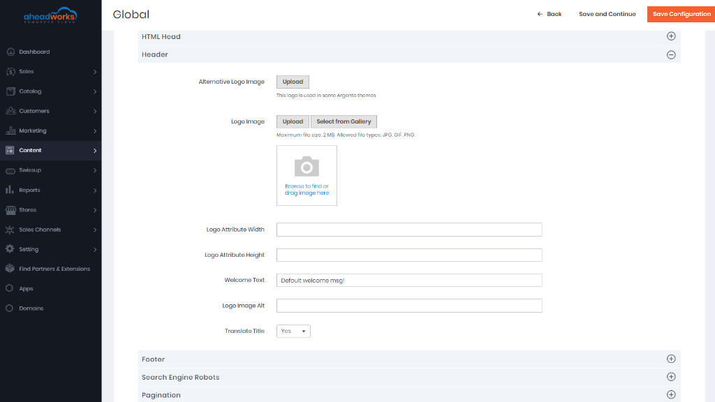
Header
The Header configuration identifies the path to your store logo and specifies the logo alt text and welcome message.
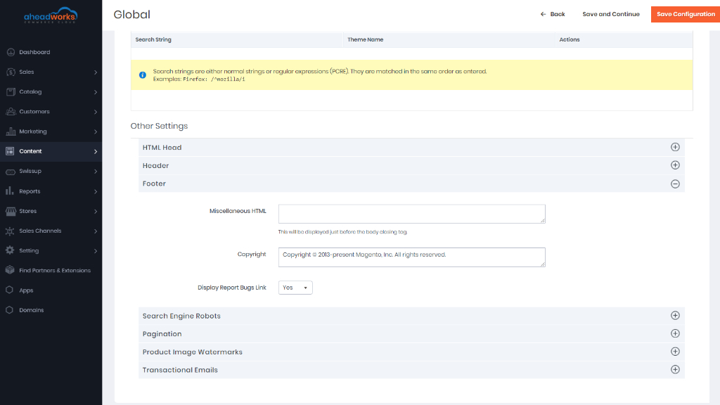
Footer
The Footer configuration section is where you can update the copyright notice that appears at the bottom of the page, and enter miscellaneous scripts that must be positioned before the closing <body> tag.
Learn more here.
Search Engine Robots
The Magento configuration includes settings to generate and manage instructions for web crawlers and bots that index your site. If the request for robots.txt reaches Magento (rather than a physical file) it is dynamically routed to the robot's controller. The instructions are directives that are recognized and followed by most search engines.
Find more information here.
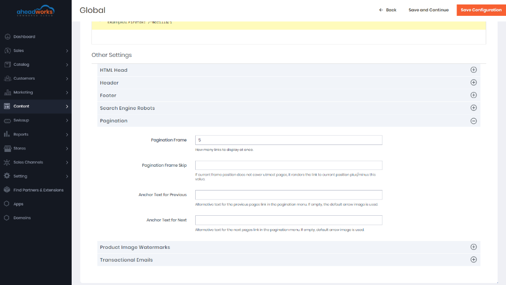
Pagination
The Pagination settings appear at the top and bottom of the list and control the format of the pagination links for product listings. You can set the number of links that appear in the control, and configure the Next and Previous links. For the pagination links to appear, there must be more products in the list than are allowed per page in the product list configuration.
Find more information here.
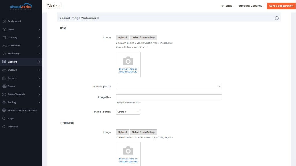
Product Image Watermarks
If you go to the expense of creating your own original product images, there is not much you can do to prevent unscrupulous competitors from stealing them with the click of a mouse. However, you can make them a less attractive target by placing a watermark on each image to identify them as your property. A watermark file can be either a JPG (JPEG), GIF, or PNG image. Both GIF and PNG file types support transparent layers, which can be used to give the watermark a transparent background.
More information can be found here.
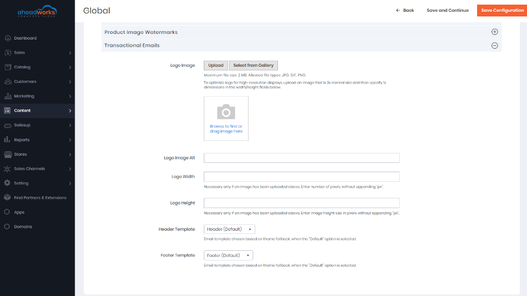
Transactional Emails
The configuration determines the logo that appears in the default header template, as well as any custom header and footer templates that you want to use for transactional email messages sent from your store(s).
More information can be found here.